The Latest NZ Freebies & Free Stuff Offers

Register with Rewardia and you can get up to $100 per month in free gift cards! Rewardia will regularly give you su … Read more
CLAIM OFFER
FunClub is looking for people to test KitKat chocolate for free, and it could be you! If free chocolate treats were … Read more
CLAIM OFFER
TiltWin is giving new users up to 200 Spins. Claim your spins at some of the greatest online slots and casino sites … Read more
CLAIM OFFER
Make your voice heard! Sign up to Opinion World New Zealand and collect points by taking regular surveys. From just … Read more
CLAIM OFFER
Sign up with Survey Spotter, and you can earn extra money in your spare time! They bring all of NZ’s best surveys t … Read more
CLAIM OFFER
It’s back! Our Paysafecard voucher giveaway returns again in 2026. Paysafecard vouchers make it easy to spend your … Read more
CLAIM OFFER
If you want to enjoy ad-free music that you can listen to anywhere, this freebie is perfect for you. You can now ge … Read more
CLAIM OFFER
Statistics for Absolute Beginners is now free on Amazon for a limited time! The eBook helps you learn statistics, a … Read more
CLAIM OFFER
You can now meet people who work from home on Work At Home Social. It is an online social network and dating commun … Read more
CLAIM OFFER
Enter this Huggies giveaway, and you can win free baby stuff! The competition is free to enter, and by submitting a … Read more
CLAIM OFFER
Register with Onecasino and get 50 free spins as a welcome bonus! On top of this, if you deposit $20, you can also … Read more
CLAIM OFFER
Brick Breaker Maker is now available for free for the PC on Steam! This is an Arkanoid-style game, so you will need … Read more
CLAIM OFFER
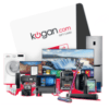
Kogan Retail and Kogan Marketplace offers products from leading brands across a wide range of categories including … Read more
CLAIM OFFER
You can get a free bundle of high-quality fonts and designs from Creative Fabrica. It is The Free Mega Craft Bundle … Read more
CLAIM OFFER
You can now try the Apple TV+ streaming service free for one month! You’ll be able to watch award-winning Apple Ori … Read more
CLAIM OFFER
Hello Fresh is a meal-kit delivery service that allows you to choose meals. They offer a variety of options, so if … Read more
CLAIM OFFER


About WOW Freebies
WOW Freebies is updated with the latest freebies, samples and free stuff for the savvy New Zealand freebie hunter. There are genuine free stuff offers added regularly for New Zealand users. There’s also loads of useful information and tools to help you save money and make money in all areas of life, so its not just great freebies on offer.
How to Get Free Stuff
Check back regularly to the WOW Freebies website to never miss the best free sample giveaways, prize draws, free stuff and more. The best offers are generally only around for a very short time so it’s important to check the website every day. Alternatively, sign up to our free newsletter above so you get the best New Zealand freebies and offers straight to your inbox.